
Chase
A Suite of Cards That Speak to Every Audience
Consulting Partner: Frog Design
Consumer Insights
Product Design
Accessible Design

Context: Chase's expanding credit and debit card portfolio was suffering from outdated and inconsistent design. As new products launched, teams had a bad habit of focusing on disparate target consumers, resulting in a disjointed approach that weakened the masterbrand.
Goal: Our mission was to unify and modernize the suite of Chase credit and debit cards to authentically represent its diverse consumers and communities. Combining consumer insights with strong visual design and product engineering elevates one of the few physical touchpoints from the bank.
Solution: A clear, repeatable design system was derived from thorough research, exploration, refinement and prototyping. It showcases the Chase masterbrand while highlighting sub-brand relationships – Sapphire, Freedom, Ink, and Slate. A cohesive card family allows each product to retain a unique signature element while staying true to Chase's heritage. These cards embody the bank's history and reliability, avoiding veneers or fake embossments found with competitors.
“It’s an incredible team of people and they have really helped us challenge our own existing perceptions on ideas.”
sapphire
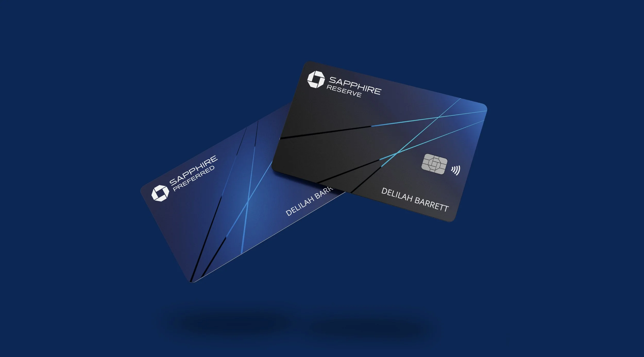

Celebrate the Richness of Gemstone
Reimagined visual facets embodies what consumers love best about Sapphire. Inspired by flight path patterns to evoke a fast paced international lifestyle.
Business
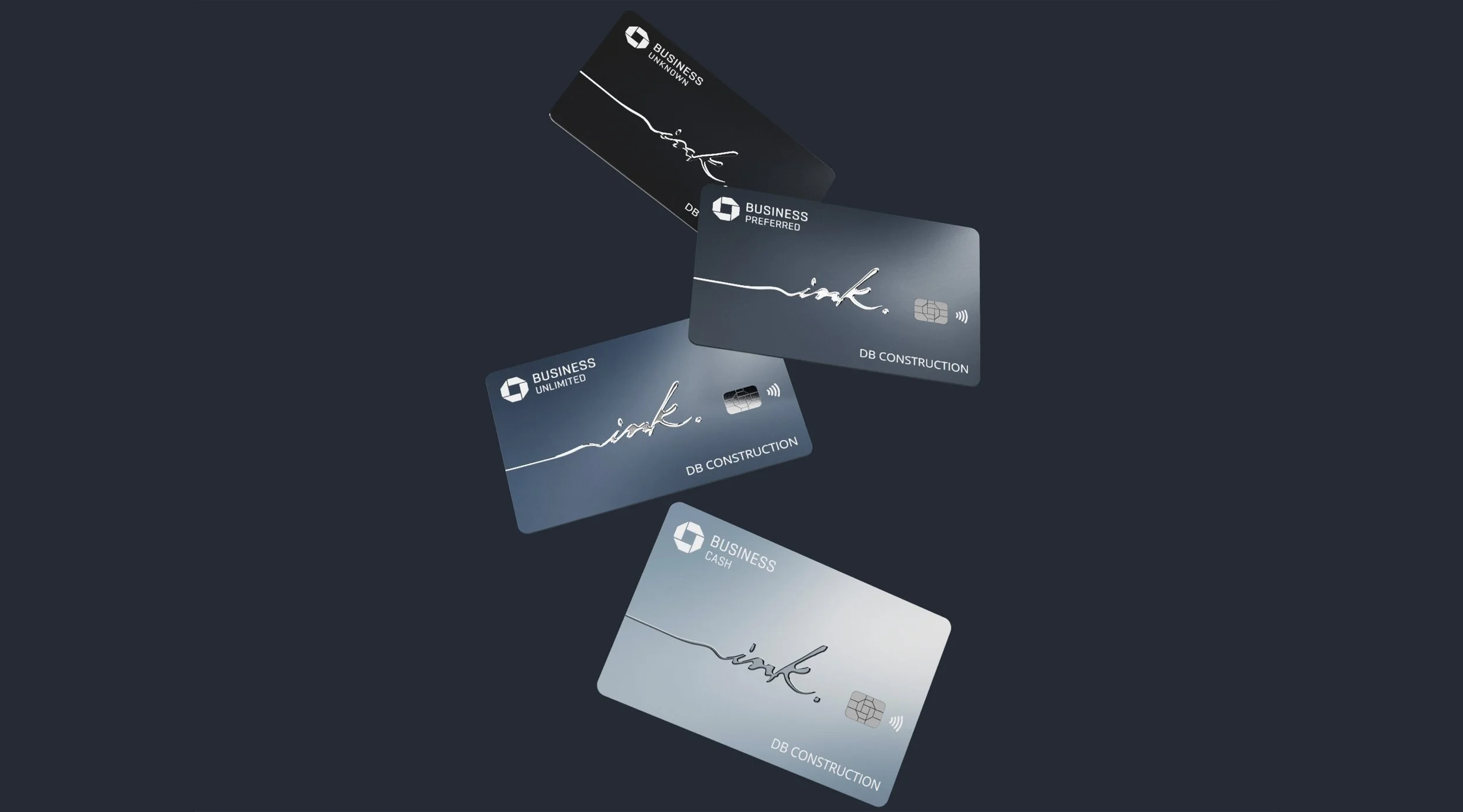

A Personal Touch
Sophisticated, confident, and personal to reflect the pride Ink cardholders take in their business.
Freedom
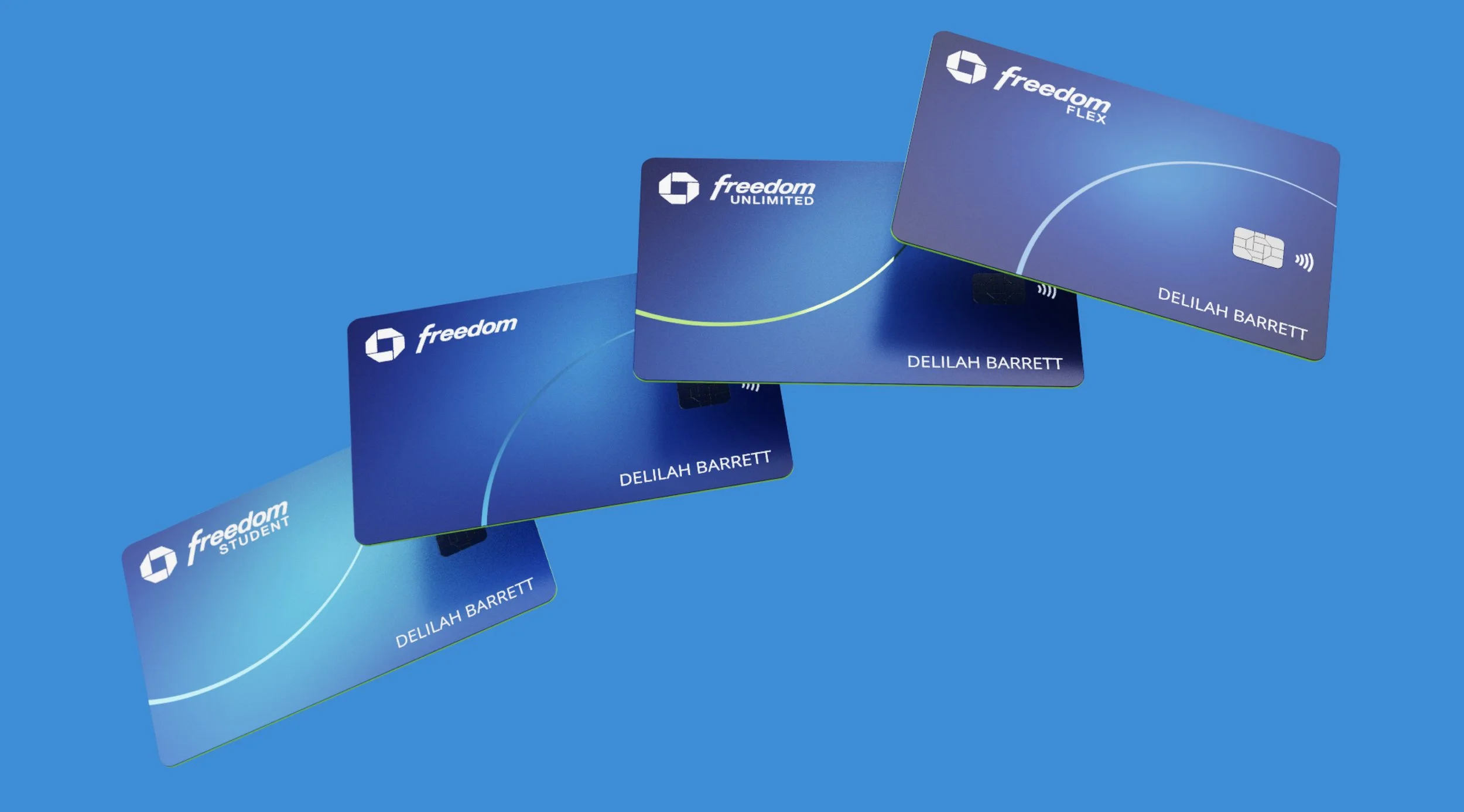
An Optimistic Arc
The arc is solid, friendly, and optimistic for Freedom consumers who consider themselves savvy with hard-earned money.
debit
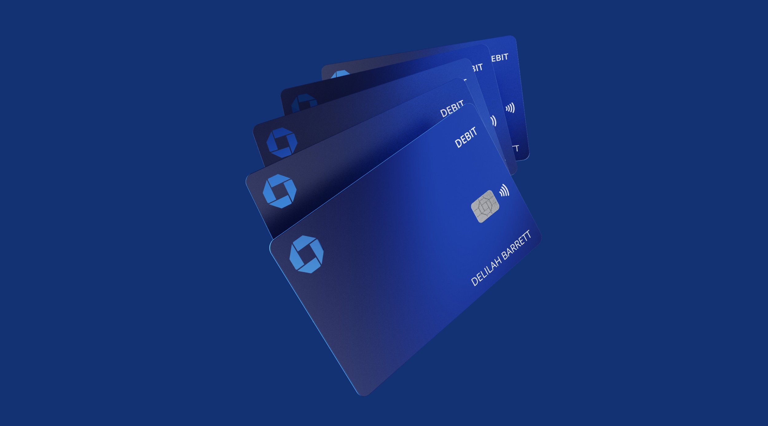
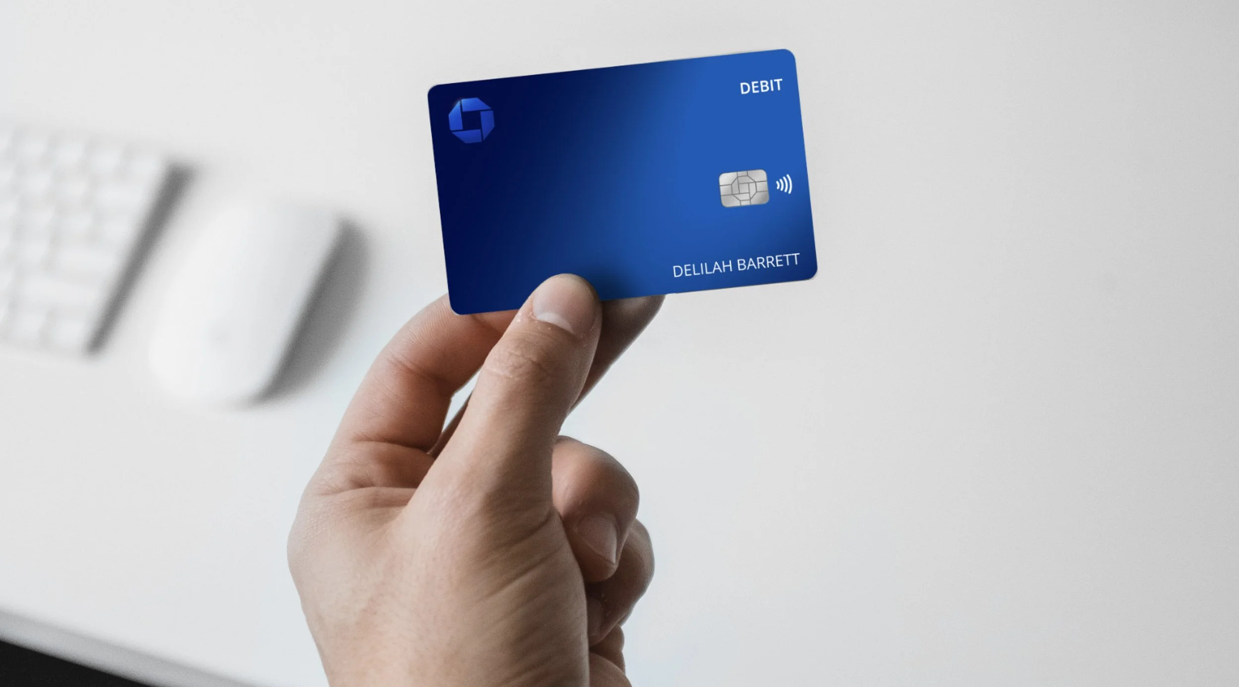
Delivers Chase Equity
No longer just a utility, this card celebrates core brand elements on a minimal layout with quality finishes and a rich gradient backdrop.
back of card
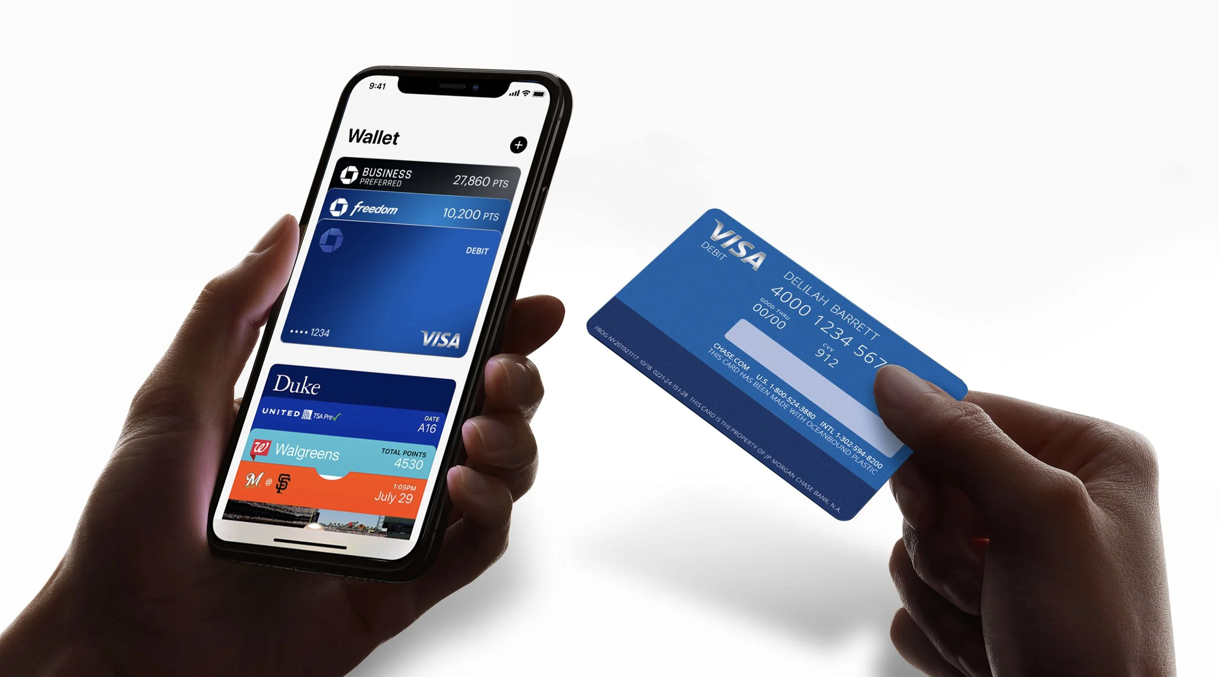
Clean & Readable
New printing technology opens the opportunity for a “dual front” design, where personal information is on one side and branding remains uncluttered on the other side.